Studio Creatae
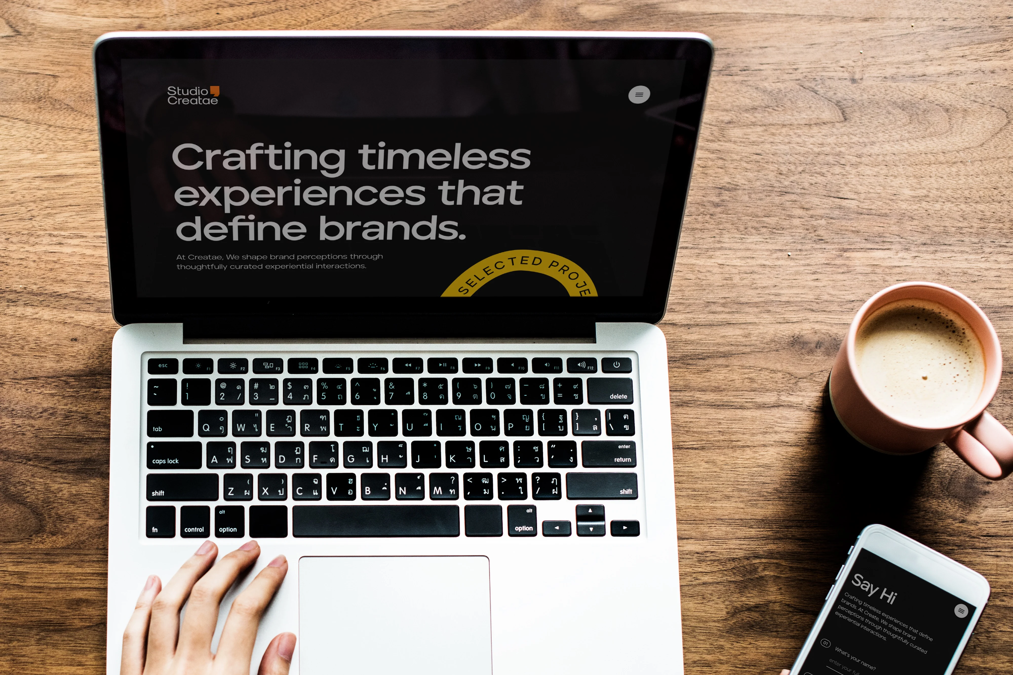
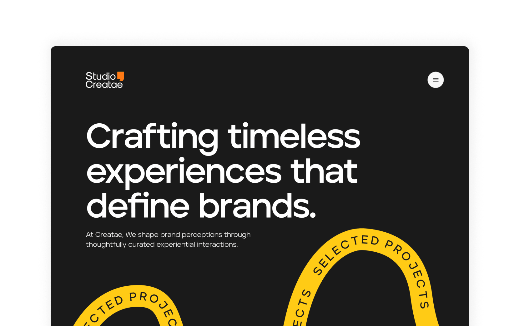
Studio Creatae is growing brands with value based experiences - using branding and marketing communications. They focus on crafting timeless experiences that define brands while shaping brand perceptions through thoughtfully-curated experiential interactions.
In Development
PROJECT OBJECTIVES
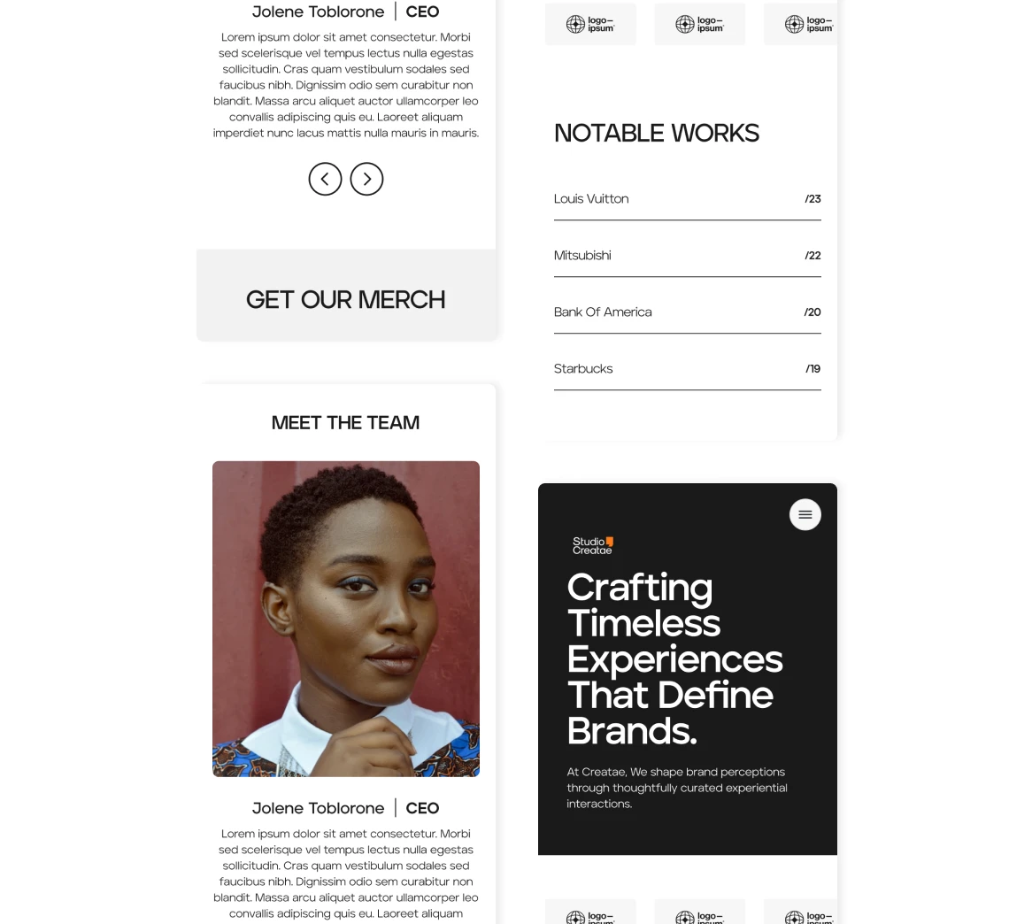
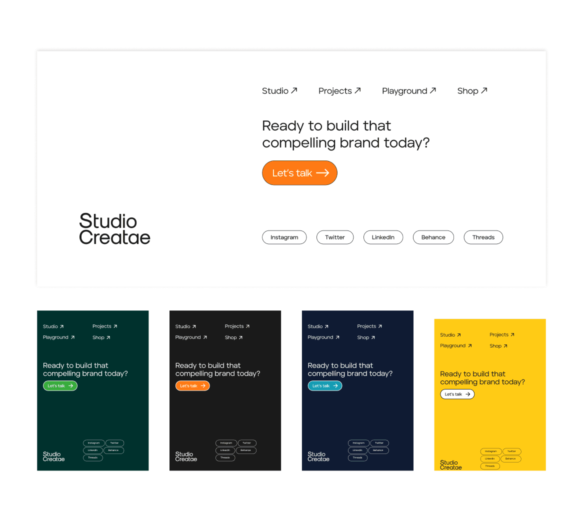
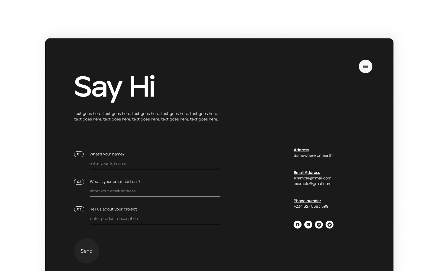
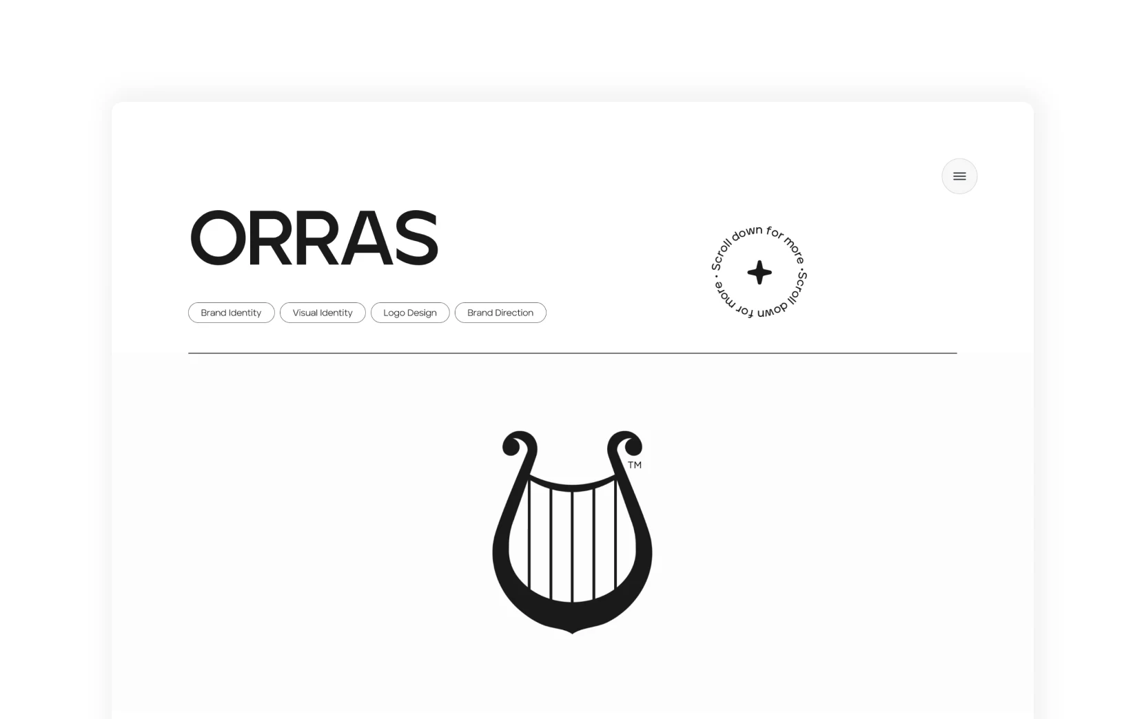
- Create a minimalistic fully-interactive prototyped user interface that caters for specific case studies for the agency and fits into the existing brand guide.
- Communicate my design process with the team and check in for review from time to time.
DESIGN PROCESS
- Brief: This involved the director sharing with me the sitemap and existing design assets to be used on the design.
- Design research: Due to the fact that the then creative director had a clear vision of how the site should look, I had to do extensive research into that particular style of designing and it helped me understand minimalism in design as most use cases are agencies in the diaspora.
- Ideation and low fidelity wireframes: I had to keep the team in the loop every step of the way, clearly explain my thought process, and have it vetted by the team before I even moved forward to designing on the canvas.
- High fidelity designs and review: This involved me bringing the sketches to live and making sure they were green-lit by the creative director as well as the web developer — making sure provisions were made for mobile as well as web.
CHALLENGES
- Due to the fact that it's a website for a design agency, I had my design go through scrutiny as well as having multiple iterations before finally agreeing on a specific interface. I'm grateful for it though.


LESSONS LEARNED
- I learned that every design iteration can always be better and to take every feedback as an opportunity to learn.
- I learned to prioritise minimalistic design that emphasises clarity and simplicity.
- I also was able to pick the brain of the developer and even understand a little about the environment he used for the final design iteration.