Kólé
Kólé is dedicated to revolutionising construction planning and management in Africa. Empowering aspiring home owners and construction professionals alike with cutting-edge digital solutions that simplify and optimise every aspect of the construction journey.
View Live Site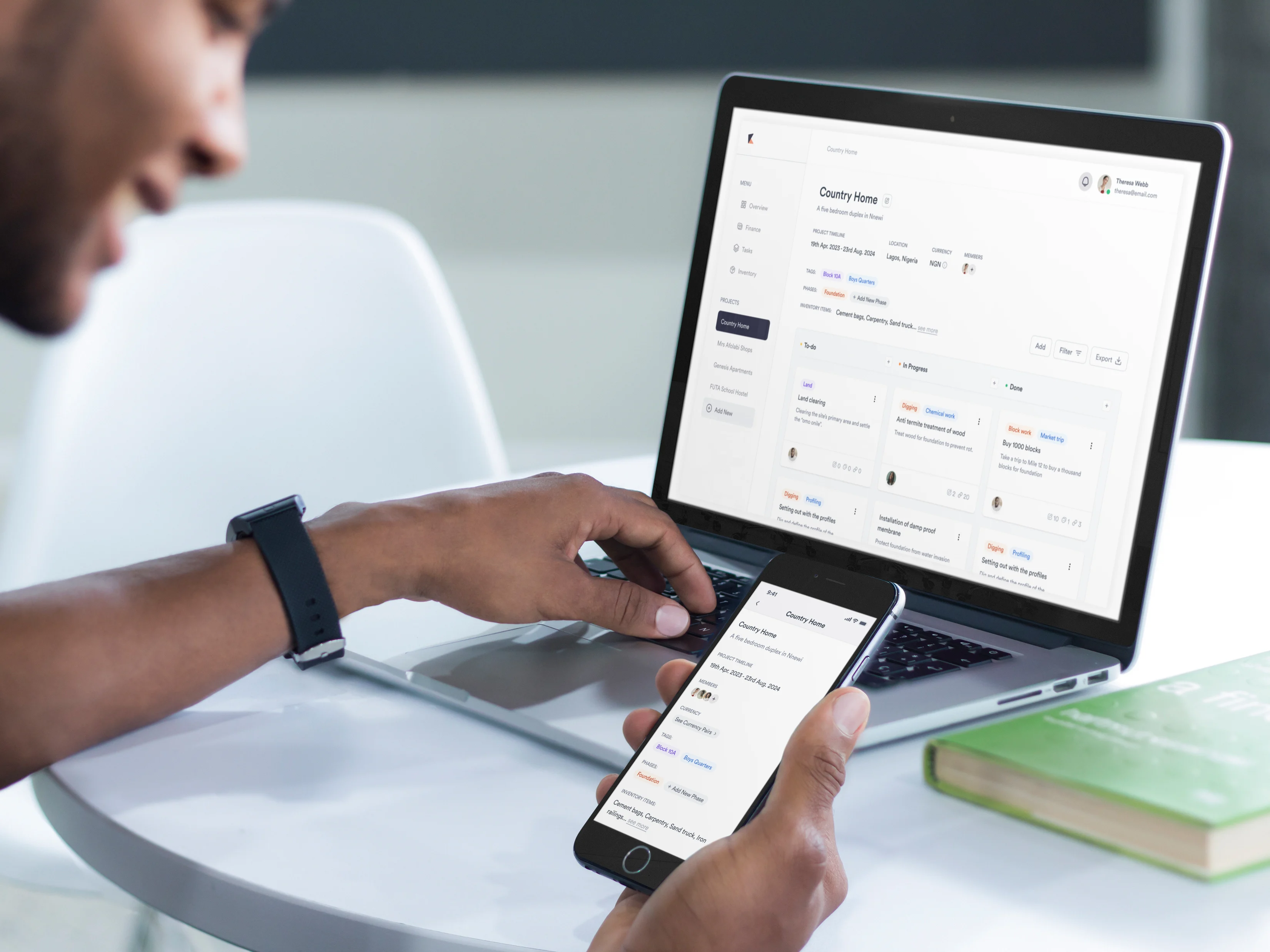
PROJECT OBJECTIVES
- Create a design system for the company.
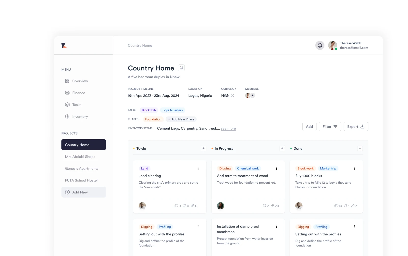
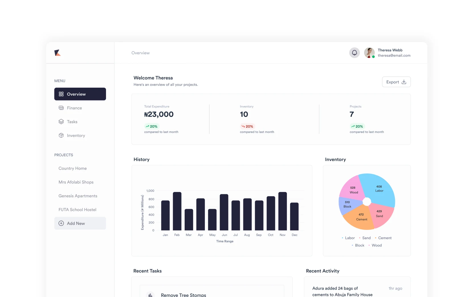
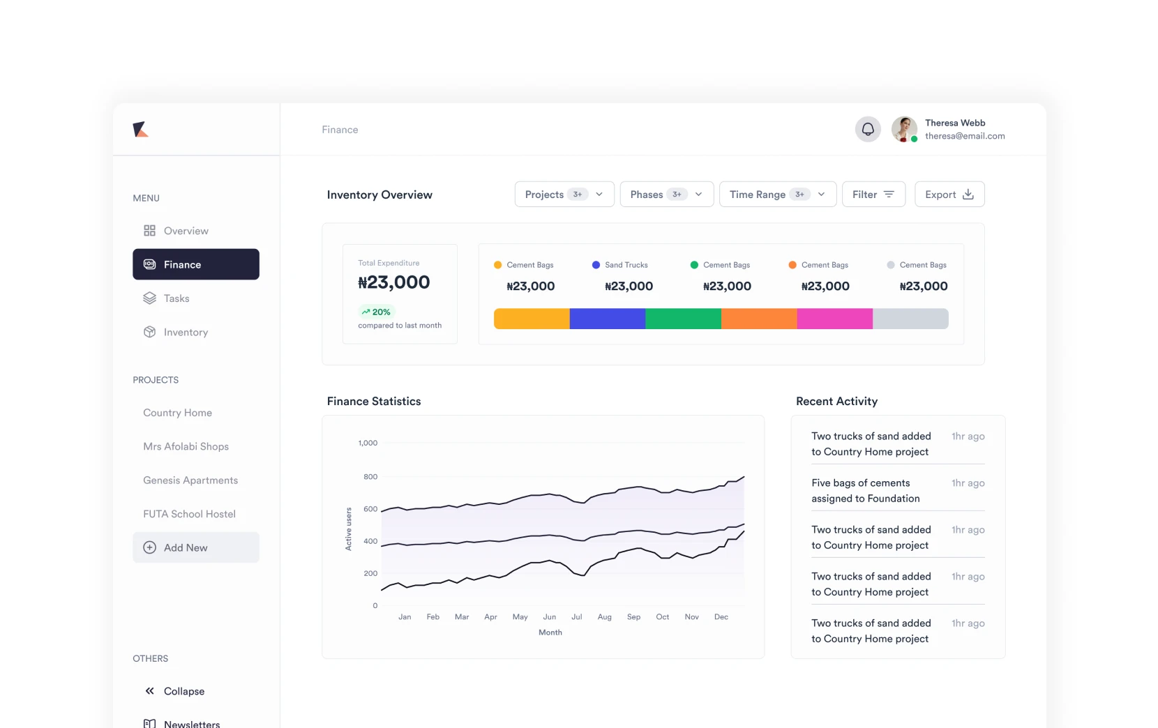
- Create a highly responsive web app that is compatible for multiple devices.
- Create a mobile app solution.
- Create two landing pages — one to accumulate emails to build the waitlist and the other to launch the software.
- Carry out usability testing from time to time to make sure that the design is adequately optimised for the problem the team is poised to solve.
- Track and monitor usage of the software while creating a better user experience from a data-driven standpoint.
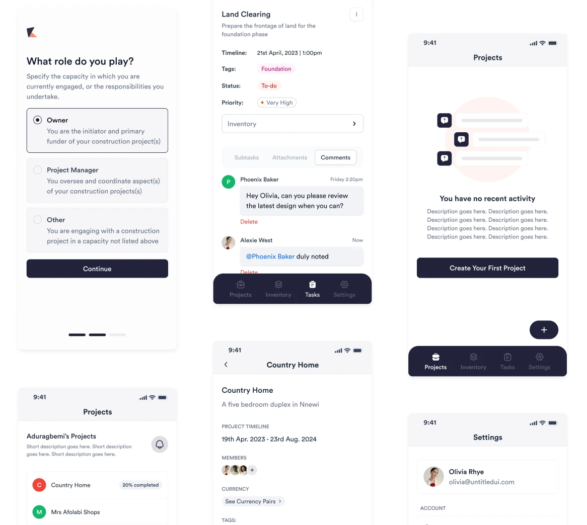
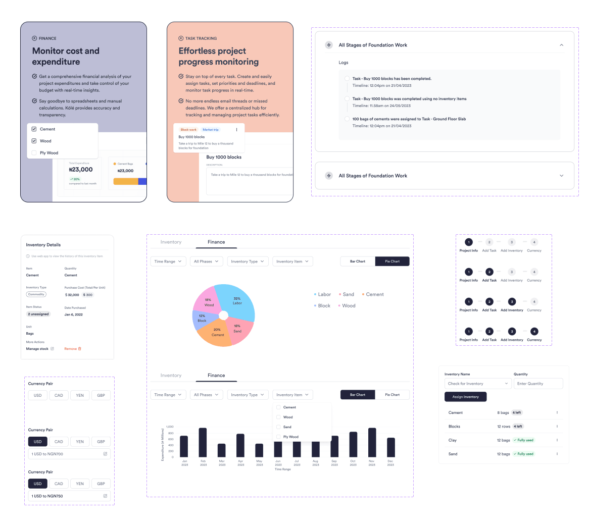
DESIGN PROCESS
- Problem discovery: This process often involved user feedback, stakeholder ideation for a business direction, or just an issue pointed out by the product manager, teammate(s) or myself.
- Research and problem understanding: Once the problem had been green-lit, I began in-depth research on the problem, how it affected our user(s) and saw how competitors were solving said problem.
- Wireframing and prototyping: After the problem was understood, I then proceeded to creating sketches of how the new feature(s) will look before finally moving on to design software. PS: I especially enjoy this process using pen and paper.
- High fidelity design iterations: This process involved ideating the low fidelity designs (wireframes) into useful and usable interface.
- Review and further iterations: The design was then reviewed by the product manager, frontend engineer, and sometimes the backend engineer if it involves matching the design to an existing endpoint.
- Push for development: Once approved, it was shipped to the frontend engineer to work on it and make a push to the test environment.
- Testing and QA: This involved me interfacing with the product managers and beta testers to make sure the feature solved the problem it set out to solve within the test environment.
CHALLENGES
- Striking the right balance between a visually appealing design and the functional requirements of the software seemed to be a challenge early on.
- Ensuring a cross-platform consistency equally seemed daunting.


LESSONS LEARNED
- I was able to observe and learn how users think through multiple user-testing processes.
- A/B testing was equally employed for certain design features and we were able to make data-driven decisions for certain features.
- I'm still learning, lol.