ErrandPay
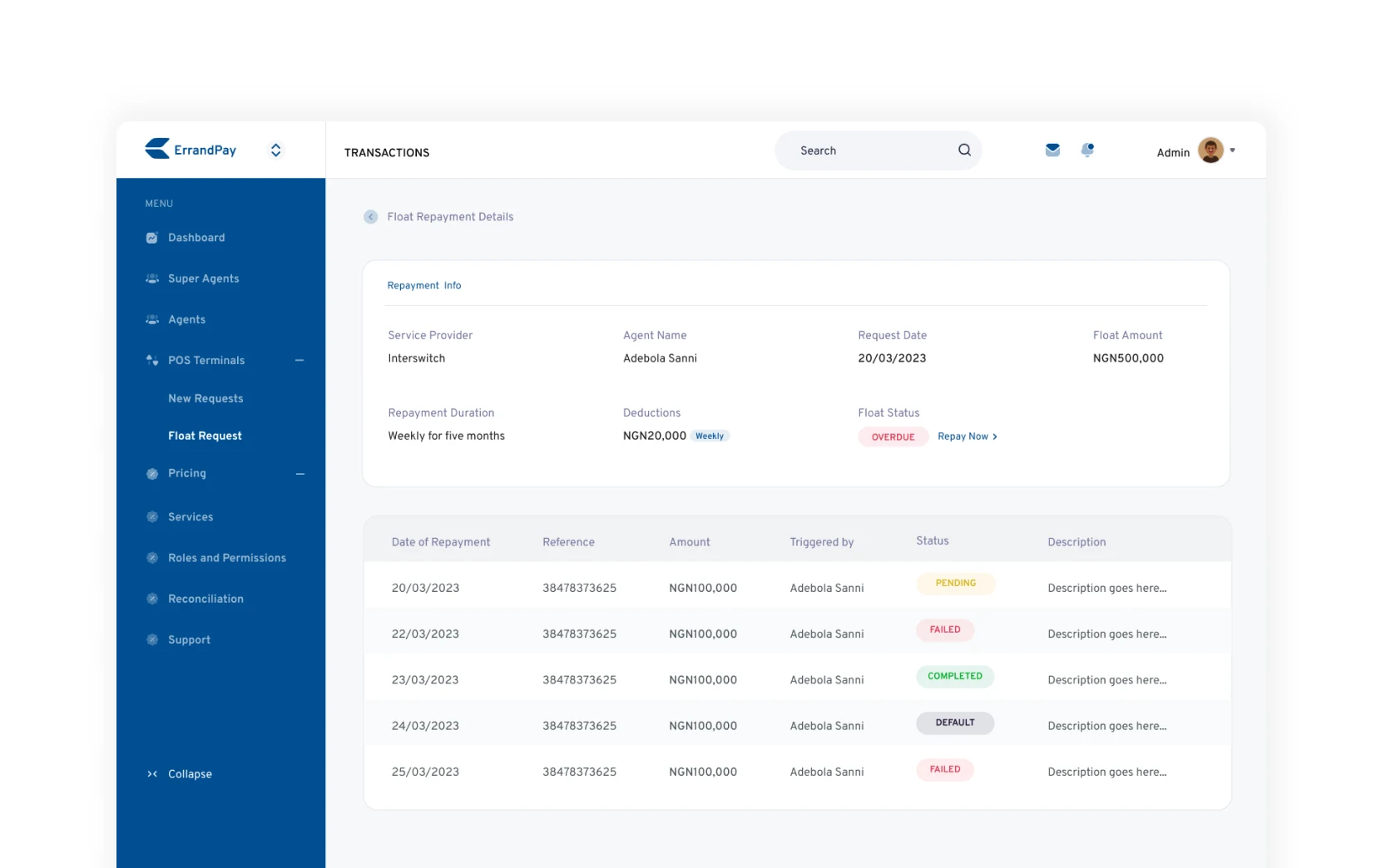
ErrandPay offers financial services to individuals and business owners to start their payment collection company in days, processing tens of millions of Naira daily with thousands of current users. They also white-label payment solutions where users can start processing payments for traders and agents, providing autonomy and customisation of services.
View Live Site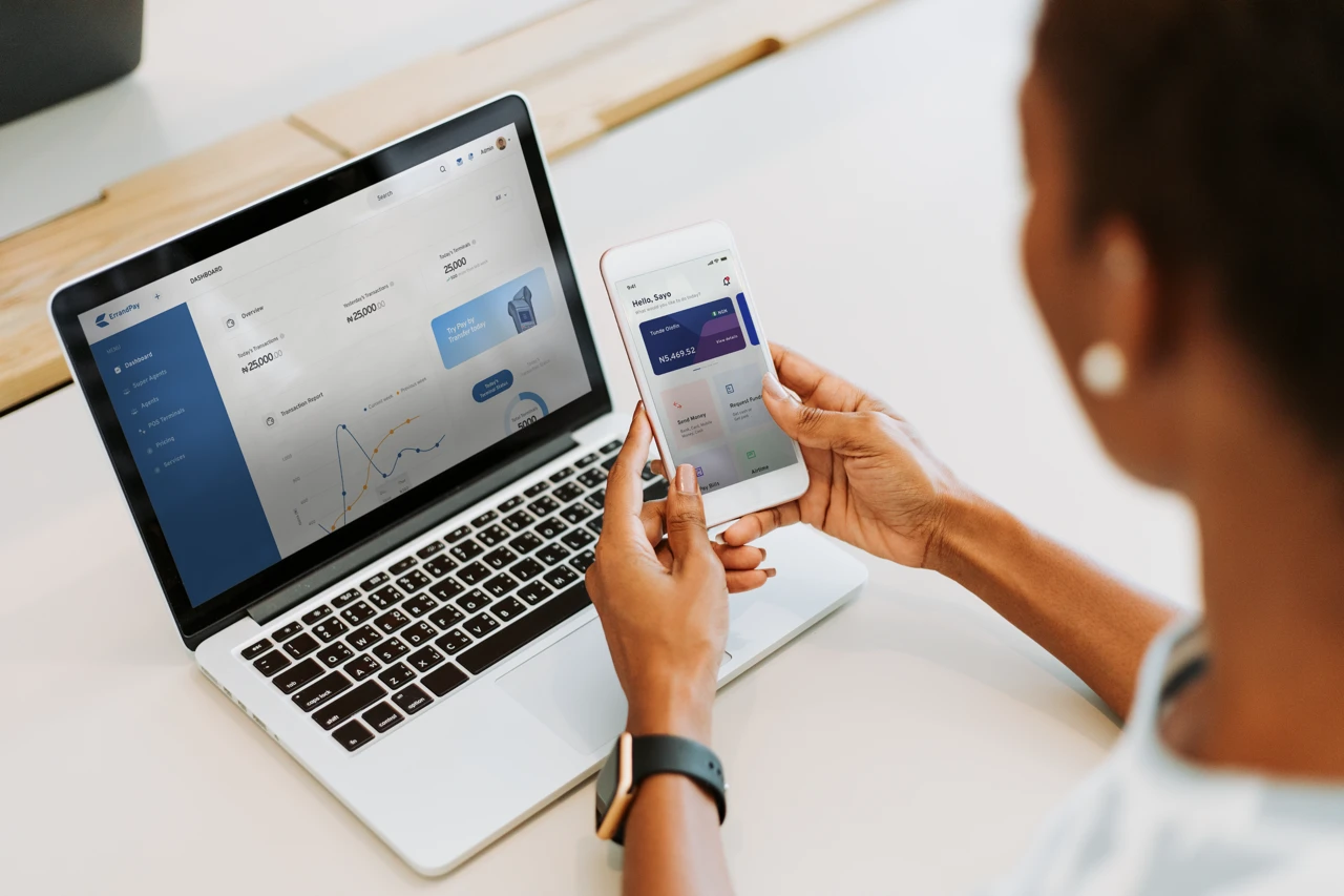
PROJECT OBJECTIVES
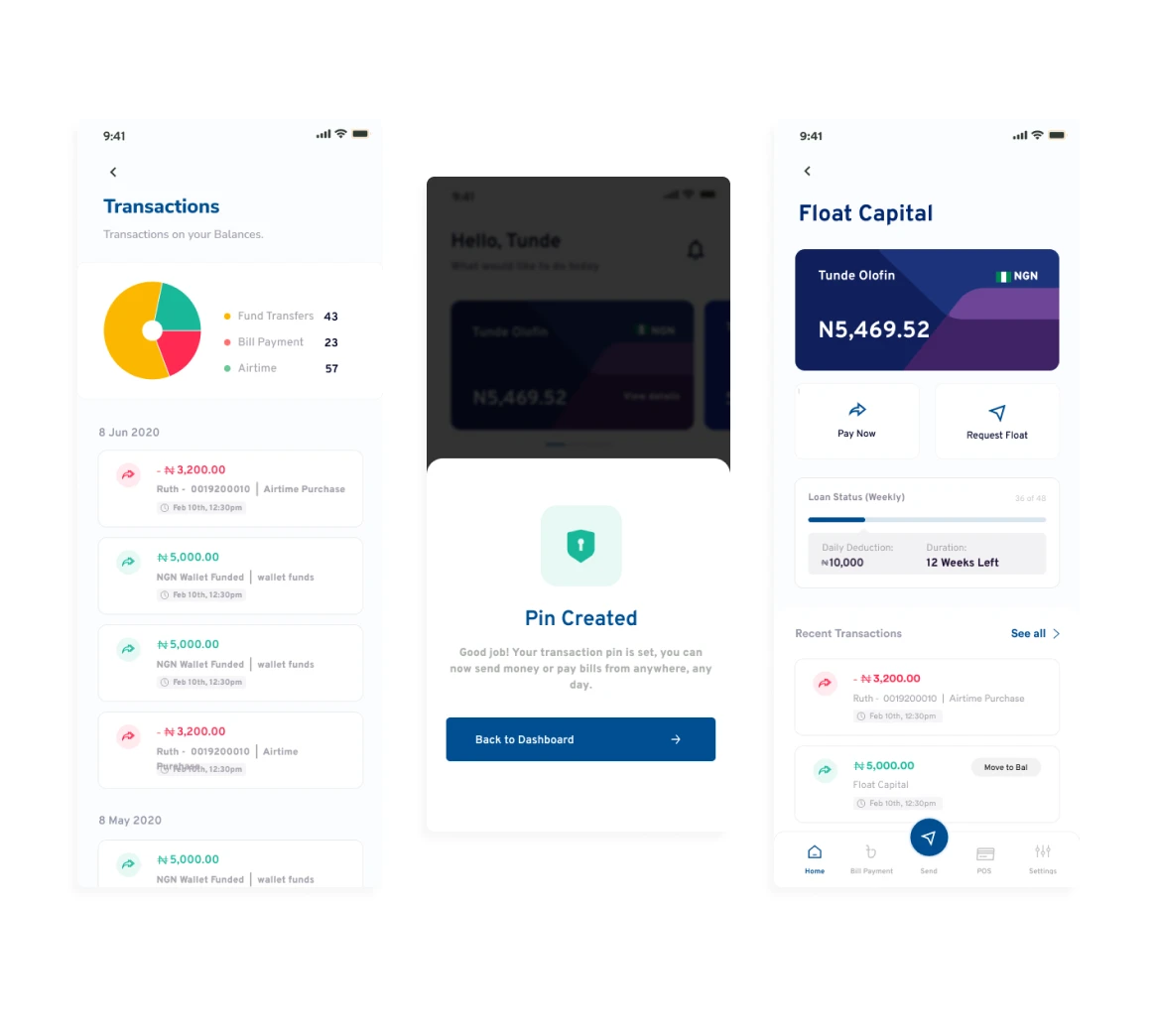
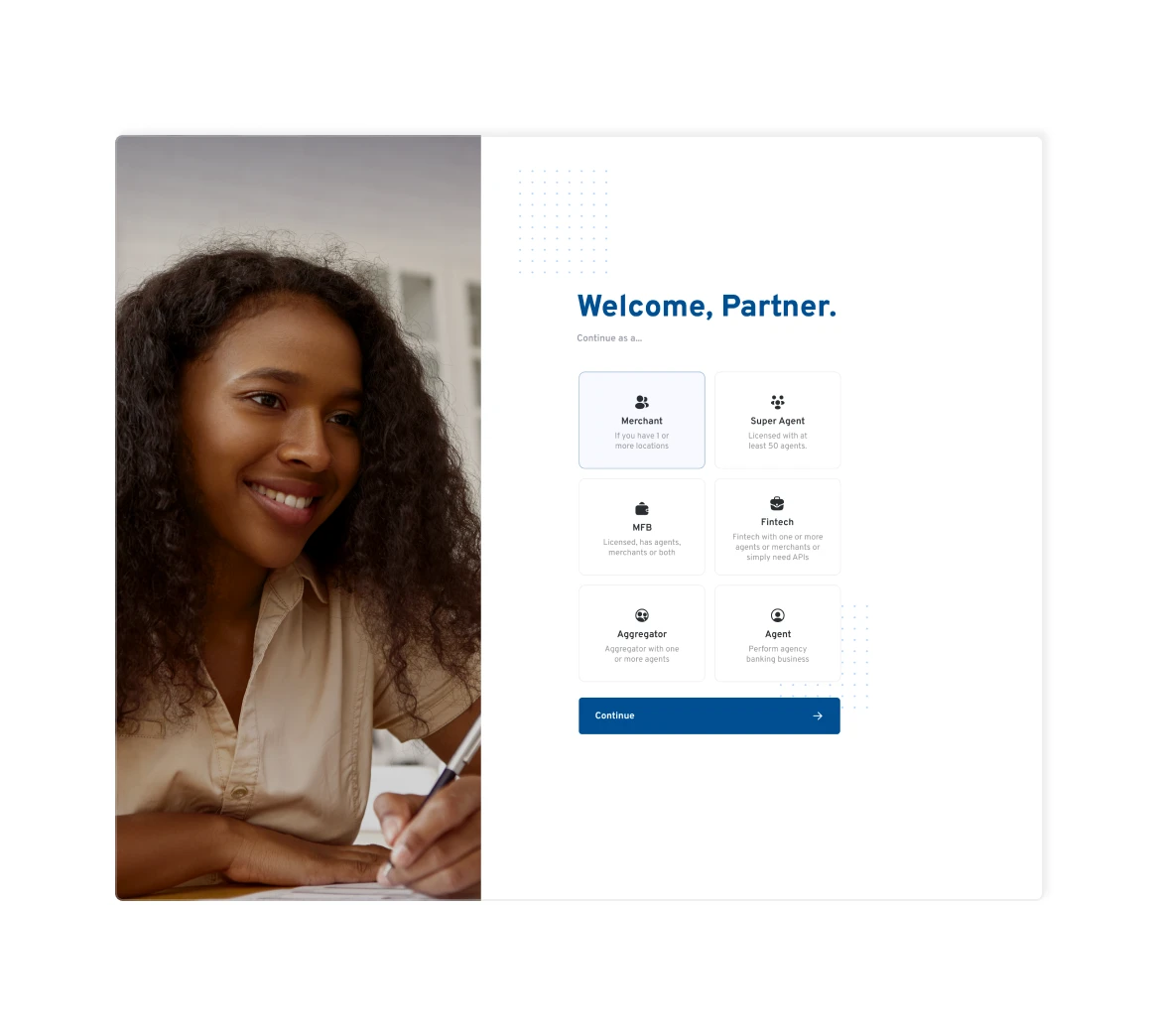
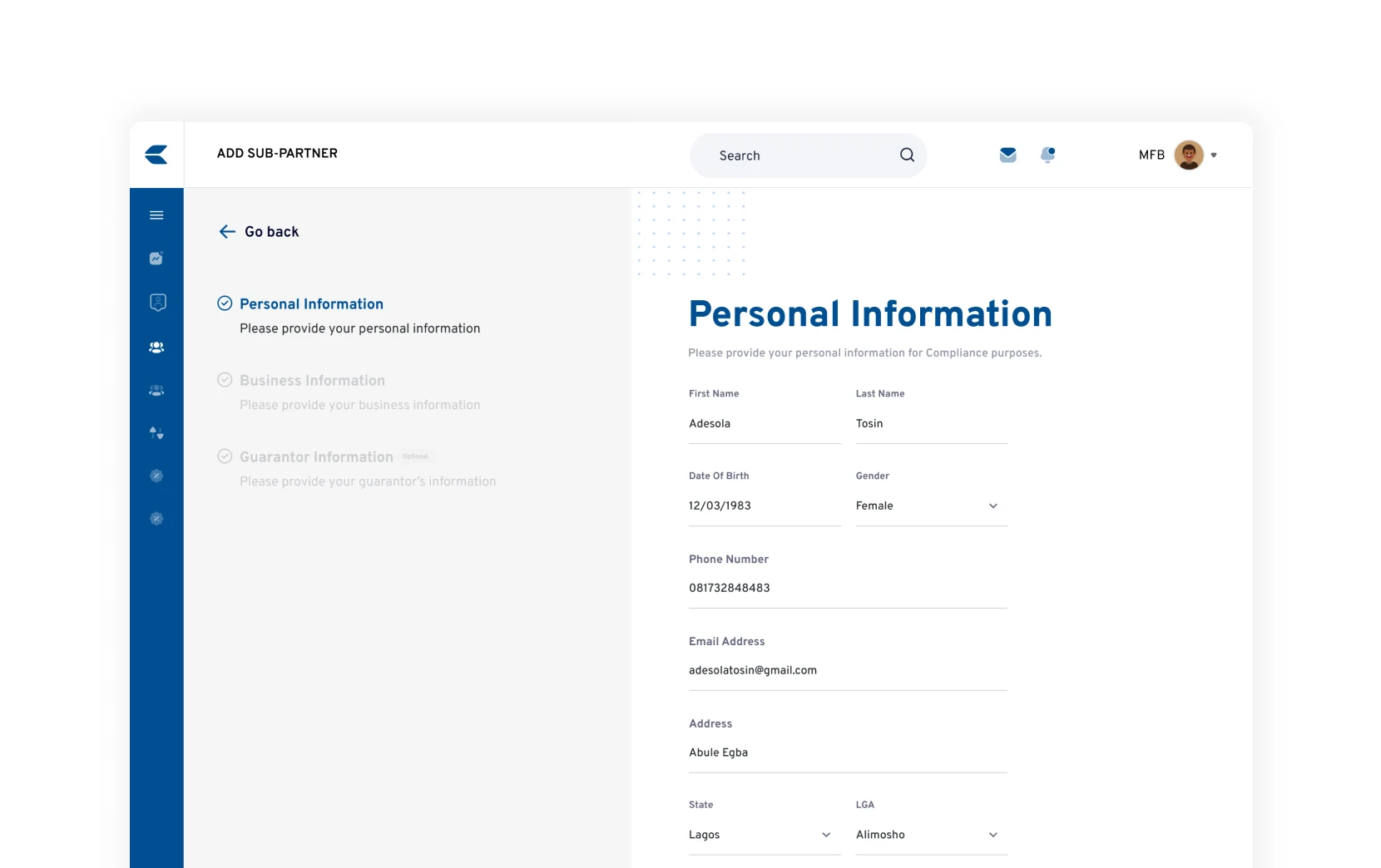
- Intuitive user interface: To create an intuitive interface that caters to users across all hierarchies.
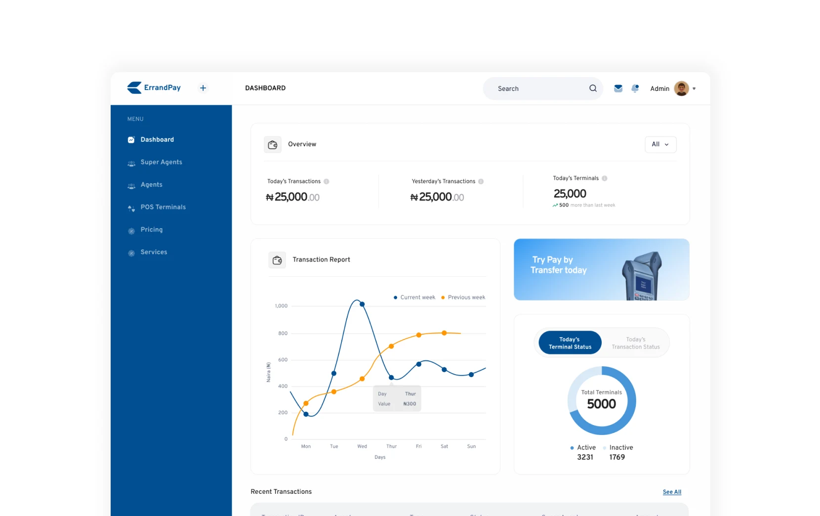
- Visual hierarchy: Users should be able to see certain data points, which should be emphasised through visual hierarchy.
- White-label business model: To create a stable version of ErrandPay's app, then multiple iterations of the app (and sometimes, administrator's back-office) to cater for the white-label end of the business model.
DESIGN PROCESS
- Problem discovery: This process often involved user feedback, stakeholder ideation for a business direction, or just an issue pointed out by the product manager, developer, teammate, or myself.
- Research and problem understanding: Once the problem had been green-lit, I began in-depth research on the problem, how it affects our user(s), and saw how competitors were solving said problem.
- Wireframing and prototyping: After the problem was understood, I then proceeded to creating sketches of how the new feature(s) would look before finally moving on to design software. PS: I especially enjoy this process using pen and paper.
- High fidelity design iterations: This process involved ideating the low fidelity designs (wireframes) into useful and usable interface.
- Review and further iterations: The design was then reviewed by the product manager and frontend developer, and sometimes the backend engineer, if it involved matching the design to an existing endpoint.
- Push for development: Once approved, it was shipped to the frontend developer to work on it and make a push to the test environment.
- Testing and QA: This involved me interfacing with the product managers and beta testers to make sure the feature solved the problem it had set out to solve within the test environment.
CHALLENGES
- Data Visualisation: This was an interesting one as financial platforms involve data collection, presentations and even repository.
- Matching design with existing endpoints: This challenge mainly came up when syncing the frontend with the backend and it was deeply insightful as I was forced to learn that the design process is a collaborative one.
- Delayed time of design implementation: When in agile environment, tasks come at certain priorities and often, upon completion of a high priority task (design wise), it sometimes doesn't get pushed to development immediately as there are often tasks of higher priority for the engineers.


LESSONS LEARNED
- The design process is never linear.
- Feedback isn't personal. Early on in my design process, I used to take feedback as personal attack but I learned to consciously make my design iteration not an extension of me and constantly remind myself that we all have the same goals in mind — be it from a teammate or from a superior.
- Designs must cater to the needs of both the users and stakeholders.